I wanna living room I wanna do my living in
We bought our house almost a year ago, but somehow our living room still looks exactly the way it did the week we moved in. A dozen still unopened boxes sit where we once thought of putting a "conversation nook." Those boxes now do double duty as a makeshift console. Ugly black IKEA bookcases from my husband's old apartment dominate half the living room; not only did we seem to have lost three of the shelves when we moved, we also unloaded CDs, DVDs, and books onto the remaining shelves in a totally haphazard and dysfunctional way. In our media area, we have two giant (4-ft. tall) old speakers from my parents-in-law's attic and two chunky old-school televisions, only one of which works.
In other words, we spend the majority of our time at home in what is the equivalent of your pervy neighbor's basement rec room.
The sad, yet wonderful thing is that our living room actually has great bones: it gets beautiful and abundant light, has lovely hardwood floors and wood window blinds, and has a spacious, open floor plan. This is what it looked like, in fact, when we first saw the house:
 |
| Photos taken by previous owners, with their furnishings. |
As you can see, it's got so much potential. So rather than living in dereliction and disorder for yet another season, this summer, we've resolved to finally make our living room functional (for my husband) and pretty (for me).
The house itself has clean, sharp lines, reminiscent of mid-century modern architecture. We're thus thinking about keeping the furnishings understated, but not too austere: lots of the functional, streamlined, and well-made woods and glass typical of mid-century modern and Scandinavian furniture, but coupled with warm colors, whimsical decorative touches, and soft, comfortable textures. A little more Domino Magazine (may she rest in peace), and a lot less Unhappy Hipster.
Here are some inspiration photos:
 |
| Domino via Flickr |
* I think the Costellos eventually found it too cluttered as well, since (as seen here and here) it now looks much more spare and edited.
 |
| Brooklyn House Co. via Design Sponge |
I'm excited about the pairing here of the Saarinen chairs with the rustic table, as well as about the seating area that seems to have a total personality disorder (island colonial daybed grouped with modern microsuede armchairs?). Plus even though the space was obviously styled for a shoot, it still looks warm and lived in, and quirky enough to reflect the owners' personalities.
 |
| Design Sponge |
 |
| Desire to Inspire |
 |
| Desire to Inspire |
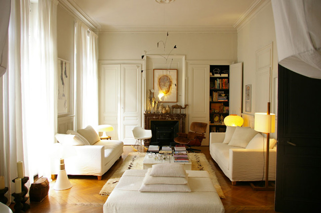
A restrained eclecticism (random wooden stool! some tall pillar candles on the floor!) makes these three white rooms look Elle Decor chic yet still comfortable. I like how the cushy, upholstered sofas soften the edges of an otherwise modern room. And don't even get me started on how much I love the Eames Rocker, even though I'm sure it's probably the most uncomfortable piece of furniture next to the Ghost Chair
 |
| Lonny Magazine via Desire to Inspire |
 |
| LTK Interiors |
Last but not least, I adore the way the juicy orange of the sofa and ottomans, and the warm tones of the brass mirrors, enliven pieces that are otherwise streamlined and modern. There are no gimmicks here; just sturdy, beautiful pieces of furniture, jazzed up with color rather than props. It's a room that doesn't look styled or fussy, but rather stylish and livable.
What do you look for in good design? Did your house's architecture inspire your decor?


4 comments:
Love that your reference two of my top blog readings in one post!!
We like looks that are functional and flexible. I want to love being in the room and looking at the room now and in 10 years. that said, I know I'll want a little change, so have pieces I can eaily swap out that will make the room look brand new on very little cash is huge.
Clean lines and restraint with a punch of color. Love.
I spit my drink back into my cup laughing when I read "your pervy neighbors basement". You never stop cracking me up!
you better fengshui that before u do any designing!
Post a Comment